Optimizing paid search ad landing pages is often overlooked. Keyword research and bidding strategies take precedence.
Driving traffic is vital, but a page’s ability to engage and convert visitors is equally as crucial.
Explore the strategies for designing and developing landing pages for paid search/PPC that attract visitors and convert them into customers.
What is a Paid Search (PPC) Landing Page?
A paid search landing page is the destination users arrive at after clicking on a pay-per-click (PPC) advertisement. These pages provide detailed information on advertised products or services and aim to prompt a specific action via a clear call-to-action (CTA).

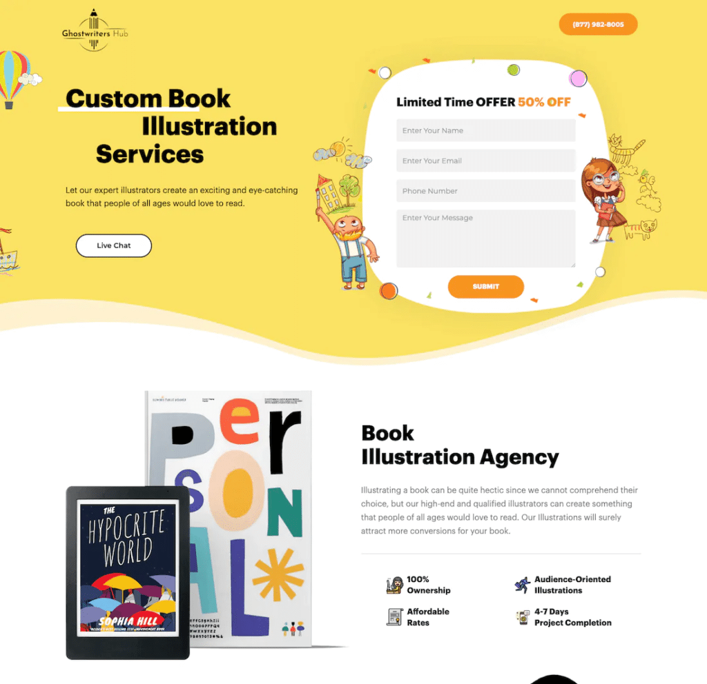
An example of a compelling PPC landing page. The page has multiple CTA buttons throughout the page to inspire action.
The Difference Between Paid Search & Organic Traffic Landing Pages
Creating and optimizing landing pages for paid search campaigns, such as those on Google or Bing Ads, are tailored to convert visitors into customers with targeted messaging and offers. These pages are often keyword-optimized to connect the ad campaign to the landing page experience.
Organic landing pages are crafted as part of a website’s broader content strategy to rank well in search engine results pages (SERPs), catering to a more general audience and a wider range of search queries.
SEO is more about building engagement, while PPC campaigns are primarily sales-oriented and designed to prompt swift action from the visitor.
What’s the key difference between paid search and organic traffic landing pages?
“Organic landing pages use SEO best practices to boost visibility in search results, targeting a broad audience with content that meets diverse search queries, supporting users at any conversion funnel stage.
Paid search landing pages, on the other hand, are specifically designed for conversions. They are directly linked to advertising campaigns, such as PPC, and optimized for a targeted set of keywords to drive immediate action from the visitor.
While organic pages focus on long-term (or “evergreen”) engagement & informational value, paid search pages are all about instant gratification and guiding the user toward a specific conversion goal.”
Sr. Marketing Data Analyst (SEO), KORTX
Why use Landing Pages for Paid Search?
Landing pages can contribute to the ultimate success of digital advertising campaigns.
Here’s why they’re essential:
1. Tailored User Experience
Landing pages allow for a customized user experience that aligns with the specific messaging and offers presented in the ad. This tailored approach increases relevance for the visitor, making them more likely to engage with the content and take the desired action.
💡 Personalized calls-to-action on landing pages perform 202% better than generic ones.
2. Higher Conversion Rates
By focusing on a single objective and removing distractions, landing pages are designed to guide users toward a specific action, such as making a purchase or signing up for a newsletter. This focus significantly boosts the likelihood of converting traffic into leads or sales, compared to directing users to a generic homepage.
💡 Placing the CTA button at the bottom of a landing page can increase conversion rates by 304%.
3. Better Quality Scores
Google Search Ads rewards relevancy. By creating landing pages that closely match the ad’s promise and contain relevant keywords, advertisers can improve their Quality Score.
A higher Quality Score leads to lower costs per click (CPC) and better ad positions, optimizing the campaign’s overall performance and cost efficiency. Google Ads’ Help Center offers five tips to improve your Quality Score.
4. Detailed Tracking and Insights
Landing pages equipped with conversion tracking tools provide invaluable data on user behavior and campaign effectiveness. Advertisers can use this data from Google Analytics or audience platforms like Axon to refine their strategies and continually improve ROI.
5. Testing & Optimization Opportunities
A/B testing elements like headlines, CTAs, and images can highlight what most appeals to your audience, providing insights to improve page performance and campaign success.
If you’re worried your homepage may perform better than a new landing page, consider A/B testing these two locations.
The Key Elements Of A PPC Landing Page
Successful paid search landing pages meet visitors’ needs and compel them to take a desired action (e.g., making a purchase or signing up for a newsletter).

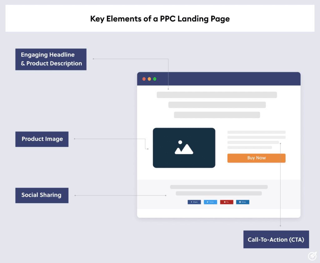
The key elements of a PPC landing page.
Here are the important components of a high-converting landing page:
- Grab Attention with a Headline: Your headline is the first thing visitors see, so make it clear, compelling, and relevant to the ad they clicked.
- Optimize for Full Visual Impact: Your page design and images should match your ad banner. Use product/service images or videos, such as explainer videos or customer testimonials.
- Provide Descriptive Product/Service Details: Provide enough info to convince visitors to take action. Focus on benefits for the visitor, not just features.
- Write a Clear Call-to-Action (CTA): Make your CTA stand out with compelling and direct text like “Buy Now,” “Sign Up,” or “Download.”
- Simplify the Opt-In/Signup Form: If collecting information, keep the form simple and ask only for necessary details. Place it above the fold for maximum conversions.
- Incorporate Trust Signals: To build credibility and trust, include testimonials, client logos, awards, certifications, or reviews.
- Inject Urgency: Create urgency with limited-time offers or indicating limited availability to push visitors towards action.
Best Practices for Paid Search Landing Pages: The Dos & Don’ts
If you’re designing a paid search landing page, we have a few dos and don’ts to help you improve your conversion rates.
1. Do: Align Page Content with Ad Copy
Ensuring that your landing page content and ad messaging are consistent provides a seamless experience for visitors, affirming that they’ve landed exactly where they expected.
This encourages visitors to engage more deeply with your page, whether that means making a purchase, signing up for a newsletter, or another desired action.
For example, this ad for Paint With Nancy Medina leads to a specific landing page to register for her free painting webinar.
The ad:

The landing page:

Google’s Quality Score helps landing pages improve ad quality rather than a score to be optimized. The three components are:
- Expected clickthrough rate: The likelihood of your ad being clicked when shown.
- Ad relevance: How closely your ad matches the intent behind a user’s search.
- Landing page experience: How relevant and useful your landing page is to people who click your ad.
These components help you determine whether to update your ad text, keyword selection, or landing page content. For each component, you’ll see a status of “Below average,” “Average,” or “Above average” and can improve accordingly.
By structuring the landing page this way, visitors experience a direct connection between the ad they clicked on and the page they landed on. This alignment is key to converting interest into action, optimizing both user experience and campaign performance.
2. Do: Write a Prominent & Clear Call-to-Action (CTA)
Crafting prominent and clear Call-to-Action (CTA) buttons or links guide visitors through the desired journey on your landing page, whether that’s making a purchase, signing up for a newsletter, or downloading a guide.
Successful CTAs have several factors to consider:
Visibility is Key
Your CTA should stand out visually from the rest of the page. Use contrasting colors, larger fonts, or strategic placement on the page. Ideally, a CTA should be placed above the fold (the visible area of the page without scrolling) and at the end of your main content.
The goal is to make it immediately noticeable to anyone viewing the page without them needing to search for it.
Clarity in Messaging
Text for a CTA button or link should leave no room for doubt about what will happen when clicked. Use action-oriented, persuasive language that’s specific to the desired outcome.
Phrases like “Buy Now,” “Sign Up for Free,” or “Download Guide” are direct and tell the user exactly what to expect.
Consistency & Relevance
Ensure that your CTA is directly related to the landing page’s content and the advertisement that brought the visitor there. This relevance reinforces the user’s intent and makes them more likely to take action.
CTA Example: Enhancv
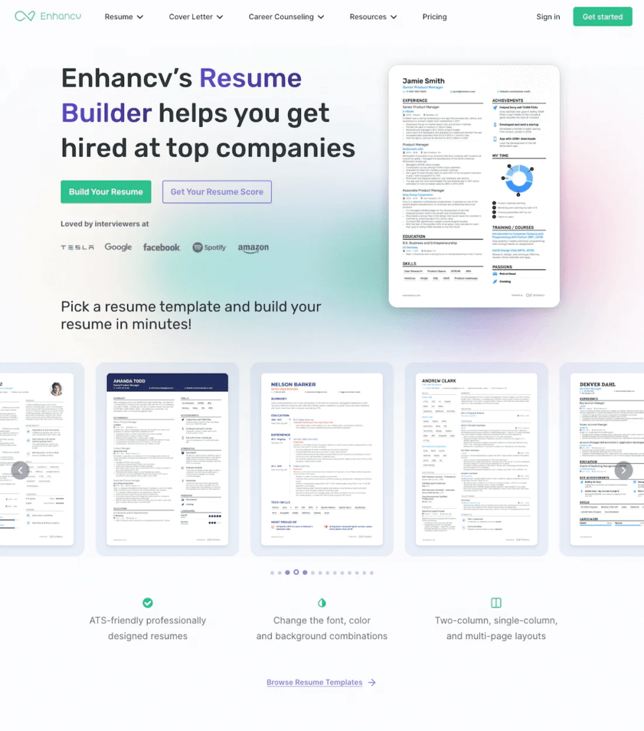
Enhancv’s landing page includes several call-to-action (CTA) strategy elements that make it a successful example.
- Contrasting Colors: The “Build Your Resume” and “Get Your Resume Score” buttons use colors that stand out against the background, making them instantly noticeable.
- Clear Action Words: The CTAs use direct and straightforward language – “Build” and “Get” – clearly stating what action the user can expect.
- Primary & Secondary Options: The page provides a primary CTA, “Build Your Resume,” which is likely the main action they want users to take. There is also a secondary CTA, “Get Your Resume Score,” for users who are not ready to commit to the primary action but are still interested in the service.
- Location: Placed above the fold, the CTAs are among the first elements seen without scrolling, making them immediately accessible to visitors.
- Relevance & Value Proposition: The CTAs are directly related to the core offering of the landing page – building a resume – and present a clear value proposition, indicating the benefit of the service (“helps you get hired at top companies”).
What makes CTAs successful?
“Effective landing page CTAs clearly reflect the actions we want users to take, such as ‘Find a Doctor,’ ‘Locate a Store,’ or ‘Get Started.’ The true power of a successful conversion strategy lies in the harmony between our overarching business objectives, the creativity of our advertisements and their call-to-action, and the user experience of our site or landing page. When these elements align seamlessly, we not only guide the user smoothly towards the desired action but also enhance the likelihood of achieving our business goals through increased engagement and conversions.”
Sr. Account Manager, KORTX
3. Do: Optimize for Both Desktop & Mobile Devices
With a significant portion of internet traffic coming from mobile devices, users expect a positive experience regardless of their device.
Your landing page should feature a responsive design that adjusts seamlessly to fit any device’s screen size and resolution. This means that the page should render properly whether a user is on a desktop with a large monitor or a smartphone with a small screen.
For example, clicking on contentwriters.com’s paid search ad on mobile brings us to this responsive page designed specifically for mobile:
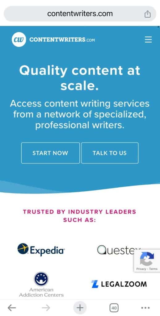
The same landing page is also optimized for desktop:

Optimizing your landing page for both desktop and mobile ensures all visitors have an engaging experience and can easily take action, enhancing your page’s overall effectiveness.
4. Do: Continuous A/B Testing
Landing page A/B testing compares two versions of a webpage—often the current version (the control) and a modified version (the variation)—to see which one performs better. It’s a methodical approach to determining the most effective elements for your landing pages, designed to help you achieve your conversion goals more efficiently.
In an A/B test, changes can range from major, like a completely new layout, to minor, like tweaking the CTA button’s color. Regardless of the change’s scale, A/B testing is a powerful tool for overcoming challenges and enhancing your landing page’s performance.
Here are the core components of landing page A/B testing:
- Control: The original version of the webpage acts as a benchmark for comparison.
- Variation: A new landing page version with specific modifications to test the effect of one or more changes.
- Hypothesis: A predictive statement detailing the expected effects of the A/B test based on the implemented changes.
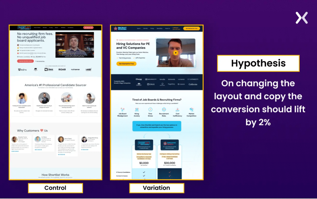
An example of paid search landing page A/B control and variation pages.
💡 Our Tip: For the most accurate insights, it’s best to change and test one element at a time. This approach isolates the effects of each modification, removing ambiguity from your optimization efforts and providing clear direction on what enhances performance.
What testing strategy works best with landing page optimization?
“Effective landing page CTAs clearly reflect the actions we want users to take, such as ‘Find a Doctor,’ ‘Locate a Store,’ or ‘Get Started.’ The true power of a successful conversion strategy lies in the harmony between our overarching business objectives, the creativity of our advertisements and their call-to-action, and the user experience of our site or landing page. When these elements align seamlessly, we not only guide the user smoothly towards the desired action but also enhance the likelihood of achieving our business goals through increased engagement and conversions.”
Sr. Account Manager, KORTX
5. Do: Conversion Tracking
Conversion tracking is fundamental for gauging the success of Google Ads campaigns. It clearly shows how users interact with your ads and landing pages and highlights which elements contribute to conversions.
To implement conversion tracking, incorporate the conversion tracking codes Google provides. Embed the unique conversion tracking codes, which Google Ads provides, onto the key pages of your landing page–typically a thank-you or confirmation page that users see after they complete a conversion action like a purchase, form submission, or sign-up.
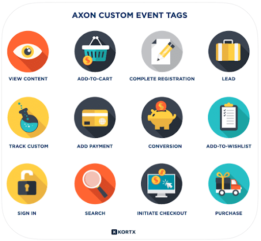
Site tagging through tools like Axon Audience Manager and Google Analytics allows for precisely tracking how users engage with the page after clicking an ad. By measuring specific interactions, such as form submissions or product purchases, and attributing them to the paid search campaign, you can determine the campaign’s ROI and identify successful elements to optimize for better performance.
6. Don’t: Slow Loading Times
Visitors expect quick access to the information they seek. Bounce rate probability increases 32% as page load time goes from 1 second to 3 seconds. The slower your landing page loads, the lower your chances of converting visitors into leads or customers.
Google’s Quality Score evaluates the relevance and usability of your landing pages. Slow loading times negatively affect this score, leading to higher cost-per-click (CPC) rates and lower ad placement.
Large files such as images, videos, or other media elements can significantly impede loading speed.
Using Google’s PageSpeed Insights (PSI) helps identify and fix slow loading times for paid search landing pages. PSI evaluates page performance on mobile and desktop, using real-world data to highlight areas for improvement. It measures key metrics like how quickly a page becomes visible and interactive, providing clear feedback on whether a page’s speed is good, needs improvement, or is poor.
Improving these metrics can enhance user experience, boost conversions, and increase your Google Ad campaign performance.
What is the most important consideration when writing a CTA for a paid search landing page?
“The text in that button can have a big impact on clickthrough rates. Visitors are more likely to click if it sounds easy (“schedule a quick call…”) or sounds valuable (“speak to an expert about…”).
No one clicks on anything until they’ve done a split-second ROI calculation in their mind. Making it seem easy or valuable changes that calculation and can have a big impact on landing page performance.”
7. Don’t: Use Complex Forms
When crafting forms on your landing page, simplicity is key. A straightforward form enhances the user experience and lowers the chance of users giving up halfway.
Stick to the essentials. Only ask for information that’s absolutely necessary for your goals, like lead generation or newsletter subscriptions. A shorter form is more inviting, making users more likely to fill it out.
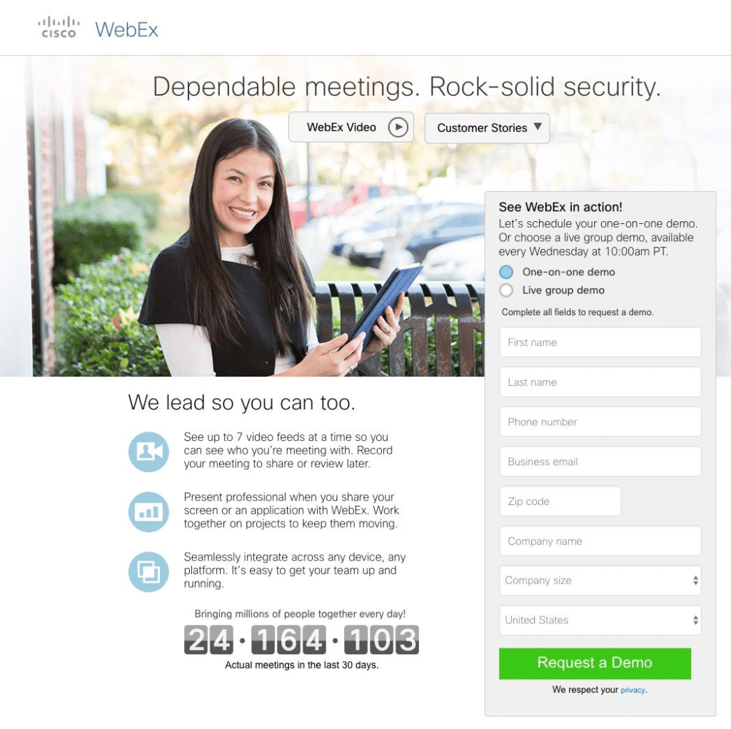
Requiring too much information too soon may intimidate users. Keep fill forms simple, requiring only essential details like an email, first, and last name.
Adopt a progressive profiling approach. Begin with just a few basic details and ask for more information incrementally as users return and engage more with your brand.
Your form should be easy to navigate with clear labels, straightforward instructions, and intuitive fields.
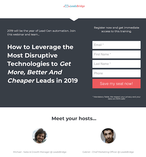
An example of a simple fill form with clear instructions and a strong CTA.
8. Don’t: Ignore Customer Testimonials
Customer testimonials and reviews provide authentic feedback from satisfied customers, showcasing positive experiences and endorsements of your products or services. Including specific details and testimonials from real customers adds authenticity and credibility to your offerings, helping to alleviate any doubts or reservations potential customers may have.
Here’s how to make those reviews work harder for you:
- Go Recent: Recent reviews best reflect your current business quality.
- Address Concerns: Feature reviews that tackle potential customer hesitations.
- Leverage Influence: Reviews from well-known figures can be particularly persuasive.
- Showcase USPs: Highlight reviews that speak directly to your unique selling points.
- Incorporate Media: Reviews with images or videos offer a richer narrative.
- High Ratings First: Emphasize reviews with stellar ratings to boost perceived value.
- Design for Attention: Use design techniques to make key reviews stand out visually.
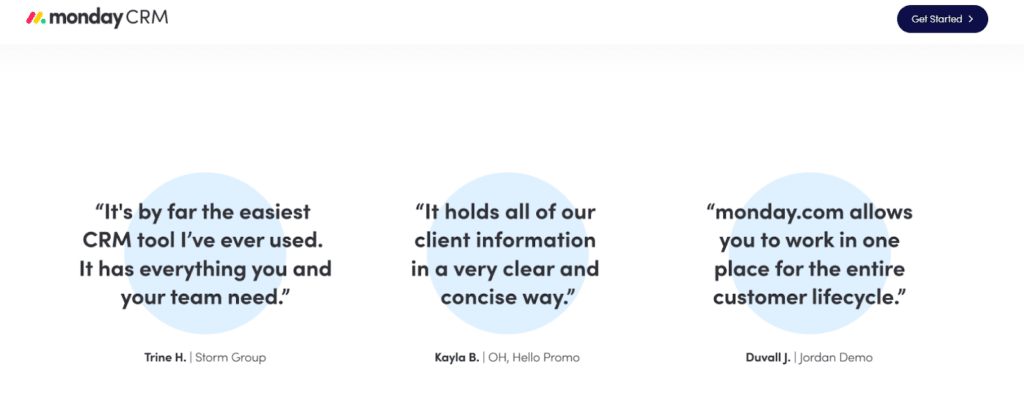
Monday CRM’s landing page adds three one-line testimonials for social proof.
9. Don’t: Neglect SEO Pages
While PPC landing pages are a potent tool in digital advertising, if not handled carefully, they can inadvertently impact SEO efforts.
The two main concerns are:
- Cannibalization: PPC landing pages can compete with SEO-optimized pages for the same keywords, potentially harming the organic page’s performance.
- Content Quality: Since PPC pages often have minimal content, they can affect your site’s standing post-Google’s helpful content update. This update prioritizes rich, valuable content for users, and pages with scant information can lower the overall site quality in Google’s eyes.
To mitigate potential SEO impacts while leveraging PPC landing pages, use no index tags. Noidex tags effectively block any search engine from putting the page in the search results,, thus avoiding any negative SEO impact without affecting PPC performance.
You would create the landing page and put this tag within the code:
<meta name=”robots” content=”noindex”>
By thoughtfully integrating PPC landing pages into your digital marketing strategy and taking precautions to protect your SEO efforts, you can enjoy the best of both worlds: effective advertising campaigns and a strong, organic online presence.
Mastering Paid Search Landing Pages
From ensuring rapid loading times and simplifying forms to strategically incorporating reviews and balancing SEO with PPC efforts, each element plays a pivotal role in converting clicks into customers.
Remember, the goal is to create a seamless, engaging experience that resonates with your audience and prompts action. By continuously testing, optimizing, and applying these principles, you’ll enhance your landing page’s performance and drive meaningful results for your business. Stay committed to refining your approach, and watch as your paid search campaigns soar to new heights.
Landing Pages That Convert
Discover how KORTX’s expert paid search services can reach your target audience and drive meaningful engagement and conversions.
About the Author
Matt Grevenstuk is an Ad Operations Specialist. Outside of KORTX, he has a passion for filmmaking and directing.
