
An attention-grabbing and straightforward CTA can be the difference between a potential lead or web visitor and a missed opportunity.
Calls-to-Action (CTAs) in advertising bridge the gap between customer interest and action.
Below, we share best practices and examples for effective CTAs in digital ad creatives.
What is a Call-to-Action (CTA)?
A Call-to-Action (CTA) is a phrase or button in an advertisement or webpage showcasing a desired action, like “Buy Now,” “Sign Up,” or “Learn More.”

This is an example of a drag-and-drop rich media ad with a clear Call-to-Action to request a free design.
Do all ads need a CTA?
“Not every ad requires a CTA. Some ads aim to build brand awareness or share information without prompting immediate action. However, if your goal is to drive sales, sign-ups, or other specific actions, including a clear CTA is very important. It guides your audience on what to do next.”

7 Call-to-Action Best Practices: How to Inspire Action
CTA goals vary depending on the campaign’s objectives, industry, and desired action, leading to unique best practices.
Despite these variations, these proven practices will captivate your audience.
1. Always align with your visitor’s intent to inspire action
Whether they’re in the early stages of research or purchase-ready, visitors are more likely to engage with a CTA that resonates with their immediate goals.
For instance, someone exploring a new topic might respond better to a “Learn More” button, while a ready buyer might click a “Buy Now” prompt.
Visitor intent/CTA mismatches occur when the Call-to-Action in an advertisement or on a website doesn’t align with what the visitor is actually seeking or ready to do.
Examples:
Informational Intent vs. Purchase CTA: A visitor wants to learn how a product works but encounters a “Buy Now” button instead of a “Learn More” or “Read More” option.
Early Stage Research vs. High Commitment CTA: A person just starting to look into a service sees a “Sign Up for a Free Trial” button but isn’t ready to commit. They’d rather have a “View Features” or “Explore Services” option.
If visitors don’t want or need what the ad offers them, they will not take action.
To create a successful CTA, consider these questions:
- What stage of the buying journey are my target visitors at? Tailor your CTA to fit whether your audience is discovering your product, considering a purchase, or ready to buy. This would mean crafting 10+ unique CTAs and choosing the most appropriate for each consumer.
- What specific action do I want my visitors to take? Define the exact response you’re seeking from your audience, whether it’s making a purchase, signing up for a newsletter, or downloading a guide.
- Is my offer clear? Ensure your ad’s message is straightforward and unambiguous.
- How can my offer provide immediate value or solve a problem for them? Highlight your product or service’s benefits or solutions, making the CTA more compelling by addressing the user’s needs or challenges.
What is the most important consideration when crafting a CTA?
“Serious gains in conversions don’t come from psychological trickery but from analyzing what your customers really need, the language that resonates with them, and how they want to buy it. It’s about relevancy and perceived value of the total offer.”

Explore the strategies for designing and developing landing pages for paid search/PPC that attract & convert visitors.
2. Use action verbs to motivate next steps
CTAs directly reflect the action you want users to take. Choose verbs that precisely describe this action.
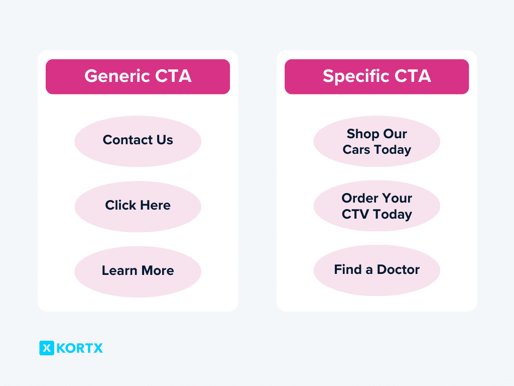
For example, instead of vague words like “Join” (what am I joining?) or “Click” (what am I clicking?) use brief but meaningful text explaining what the link or button does, like “Discover our services” or “Join our learning community.”
Avoid CTA text like “Click here to join X” or “Learn more about how we got started.” Take out the “click” or “learn more” as they’re unnecessary. “Discover X” or “How we got started” is brief and direct.
Aim for shorter, punchy phrases that propel action.
3. Tailor your CTA to the ad size
Specificity and brevity are key. The device and ad size greatly influence button length and design.
With 58.67% of traffic coming from mobile devices, CTAs need to be succinct and easily actionable on smaller screens.
While an 8-word CTA such as “See how we raised our clickthrough rates” might be informative, it’s often too lengthy for smaller ad formats like a 300×50 ad unit.
A clear and concise CTA like “See How It Works,” “Get the Details,” “Sign Up Now,” can be effective without overwhelming the limited space.
Integrating the CTA into the ad copy itself or relying on the ad’s visual design can also direct user behavior without needing an explicit button.
You can be more direct and wordy when space is less of an issue. banner ads or video ads with overlay CTAs provide a larger palette.
Example: Our client’s video campaign added a CTA overlay with clear instructions. This allowed for slightly longer CTAs like “Watch Our Success Story” or “Find a Doctor Near You,” engaging users with more context.
4. Tailor to ad type
Each advertising channel has its own set of rules and user expectations.
Formats like display ads often directly lead users to the promised offer, creating a simple or streamlined path to conversion. Connected TV (CTV) ads don’t offer the option to click, so CTAs here might focus on memorable slogans or short web urls that viewers can search for later.
With CTV, we can track cross-device conversions. Through crafting a strong CTA, we can monitor and report on users who take the desired action on another device.
Interactive Connected TV (CTV) ads allow viewers to engage with the ad creative, allowing for a level of interaction traditionally reserved for digital platforms. Interactive CTAs can feature QR codes that, when scanned by a mobile device, direct users to a targeted offer page or app download.
How can advertisers boost CTA effectiveness in environments with limited interaction, like CTV?
“In spaces where direct interaction poses a challenge, QR codes can bridge the interaction gap. This approach transforms the CTA into an actionable element for the audience. This approach also enables us to track engagement directly attributed to specific ads. Doing so opens a direct and quantifiable route to the promised offer or landing page, thereby enhancing the ad’s overall effectiveness and measurability.”
5. Personalize the ad to increase engagement
Statista found 95% of marketers rated their personalization strategies as (somewhat or very) successful in their efforts, extending down to digital ads. This success hinges on balance–CTAs should feel personalized but still play into your broader audience. Overly niche CTAs may alienate parts of your audience.
For example, language-specific campaigns, like those run by one of our clients in seven different languages, tailor ad content for specific groups without narrowing the focus.
Dynamic CTAs enhance personalized campaigns by tailoring messages for specific audience segments without multiple creative sets. This level of customization requires a careful assessment of campaign goals and the potential diversity within the target audience.
Personalization may also change based on your target audience’s stage in the buyer’s journey.
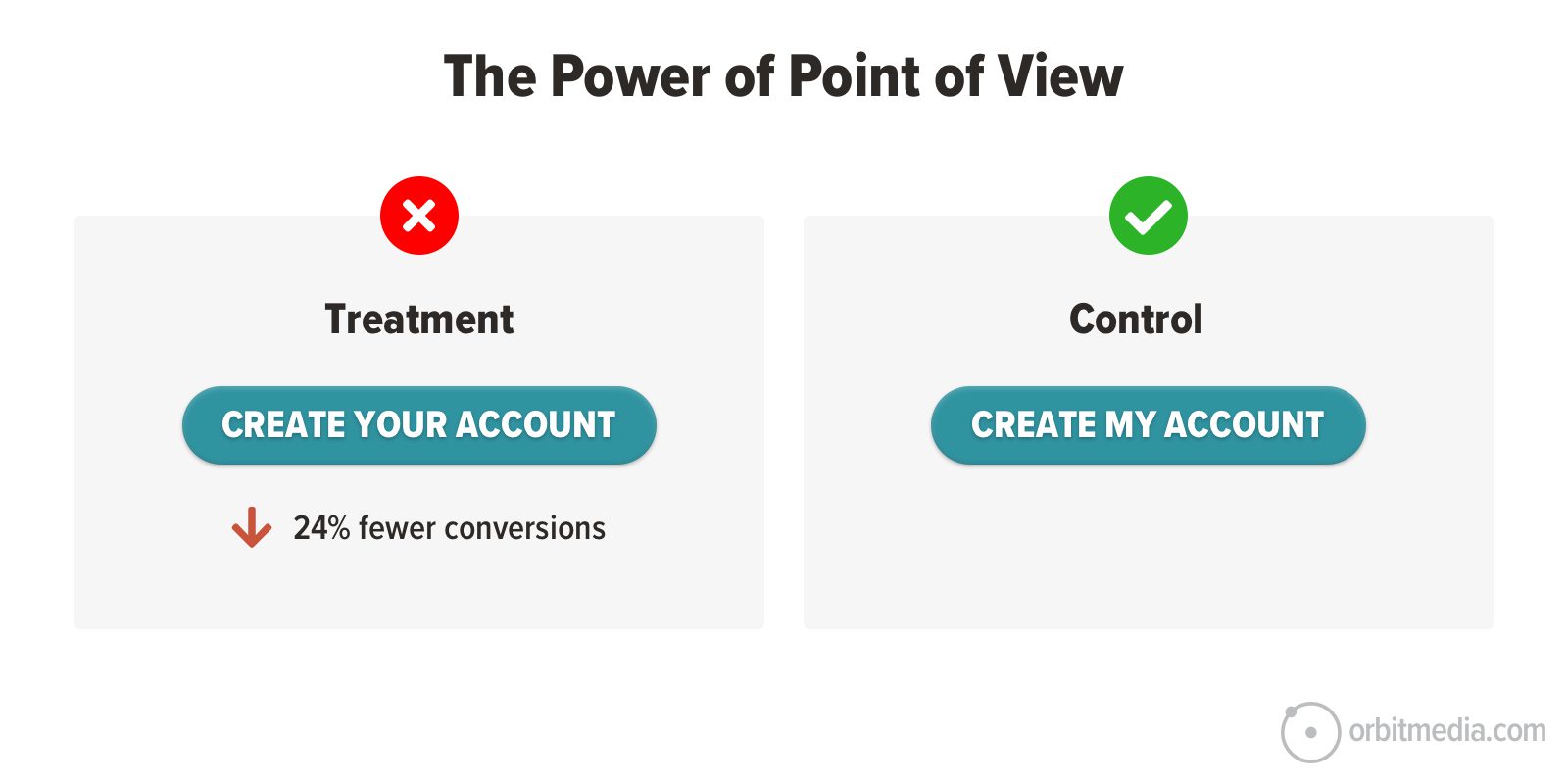
For conversion-focused landing pages, for instance, using first or second-person language in the CTA can make the Call-to-Action feel more personal and direct.
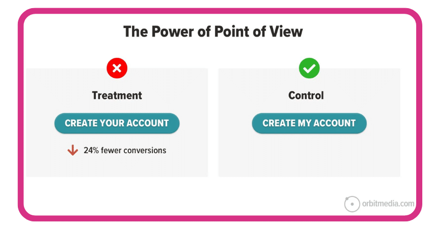
Orbit Media found that first-person language yields 24% higher conversion rates.
The other alternative is to avoid pronouns and use Jonathan Richards’s “WYLTIWLT (would you like to, I would like to)” test.
If your button text is “Read More,” you could ask, “Would you like to read more?” and answer, “I would like to read more.” Since it works as both a question and an answer, it passes the WYLTIWLT test.
This tests if your button starts with an action word and matches the customer’s voice.
CTA personalization is not a one-size-fits-all solution. It is a flexible strategy that requires understanding your audience, balancing specificity with appeal, and adjusting based on the campaign’s context and goals.
6. Make your buttons stand out with design
Every advertisement has a visual hierarchy. Within this hierarchy, your CTA button should be a focal point, standing out through thoughtful design choices that prompt users to take the desired action.
Our visual system is hardwired to notice elements that stand out from their environment, a phenomenon known as the Von Restorff Effect. This principle plays a crucial role in designing effective CTAs.
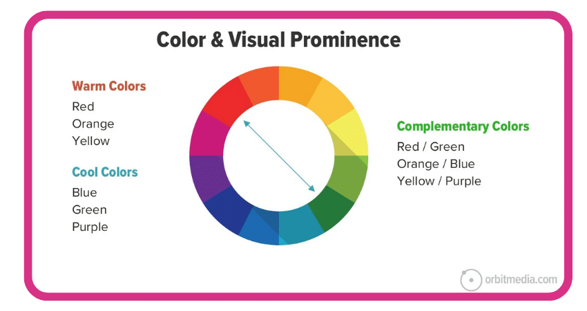
Utilizing color contrast is a strategic way to highlight CTAs. Colors that sit opposite each other on the color wheel, known as complementary colors, create the most striking contrasts.
For instance, warm hues like red, orange, and yellow vividly stand out against cool tones such as green, purple, and blue, making them excellent choices for drawing attention to CTAs.
Some designs adopt a specific “action color” for all interactive elements, such as links and buttons, to ensure they consistently catch the user’s eye.
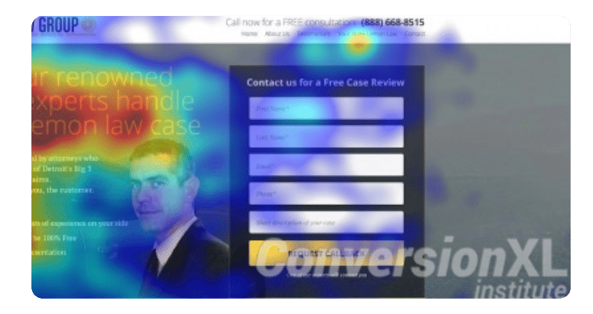
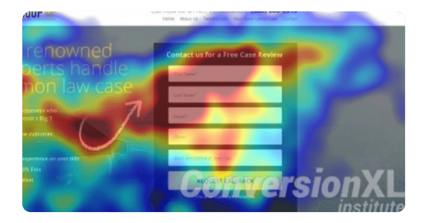
Eye-tracking studies, such as those conducted by Speero by CXL, use heat maps to demonstrate how certain elements (including color, facial direction, and arrows) can significantly influence where users focus their attention on a page.
CXL Results Summary
- Visual cues pull users to focus on the form differently.
- A hand-drawn arrow kept attention on the form longest, while a human looking away had the shortest focus.
- The cues didn’t change how quickly users noticed the form or how well they remembered it.
Emphasizing CTA Buttons Visually
Consider these design principles for your CTAs:
- Color & Contrast: Use contrasting colors for your CTA button to stand out against the background and ad elements. Choose vibrant colors like red or orange to evoke excitement or urgency.
- Size & Shape: Your CTA button should be easily clickable on your chosen ad format without overwhelming the ad. Rounded corners can make buttons more visible and inviting.
- Placement: Place your CTA button where viewers naturally look while scanning the ad, usually at the message’s end, serving as a natural conclusion.
- Typography: The CTA text font should be clear, readable, and stand out on the button. Consider using bold typography that’s legible even on mobile.
- Whitespace: Don’t underestimate the power of whitespace (or negative space) around your CTA button. Whitespace reduces visual clutter. Boosting button visibility improves ad appeal.
What are some tips for designing a visually engaging CTA?
“Button designers can use contrasting colors to draw attention to the desired action. The strongest contrasts are colors on opposite sides of the color wheel. These are called complementary colors. Warm colors (red, orange and yellow) contrast with cool colors (green, purple and blue).
Some web designs even pick one color to be the “action color” using that color on all links and buttons and for nothing else.
Faces can also guide attention. Humans are naturally inclined to look where others look. So images of people looking toward a button can make that button more obvious.”

7. Don’t just measure clicks (you’ll miss important information!)
While clicks indicate interest, they don’t always correlate with high-quality traffic or genuine intent to engage or purchase.
A low-commitment Call-to-Action (CTA), such as “Learn More,” might drive a high volume of clicks, but the subsequent engagement—measured through visits, sign-ups, conversions, and revenue—truly reflects an ad’s success.
Why is measuring click-through rates for ads an outdated success metric?
“Let’s face it, most people don’t click banner ads. But that doesn’t mean they don’t work. If an ad intrigues me, I tend to open a new tab and then search for the product/offer I saw in the ad, and I know I’m not the only one who does this.
This is why how we measure campaign success is so important. If every marketer solely focused on click rates, they wouldn’t get anywhere near the true impact their ads had. Additional measurements such as website attribution, foot traffic studies, and brand lift studies all play a role in measuring the holistic impact of your messaging.
Also, properly tagging your site allows for better post-ad exposure measurement, regardless of when the user clicked. Through these insights, you can make better-informed decisions about how to evaluate and optimize messaging.”
Other than CTR, what metric should I use?
“Prioritizing CTR can reduce effectiveness if the goal is to encourage site actions beyond measurement. Typically, an algorithm can’t distinguish between genuine and accidental clicks. This explains why click-campaigns skew towards mobile, due to accidental clicks from scrolling. By having a digital campaign optimize toward a desired action on your site, the algorithm optimizes toward users who are likely to complete that action regardless of them clicking the ad itself.”

These insights above reinforce the foundational strategy of aligning the CTA with the visitor’s intent, capturing true interest for meaningful engagement.
Accidental clicks are a common aspect of digital advertising, but they don’t diminish the success of a well-crafted CTA. Even without direct ad interaction, a user can still take valuable actions.
Advanced tracking capabilities allow advertisers to go beyond click metrics. Site tagging and post-view action tracking enable a comprehensive analysis of user behavior on the advertiser’s website, regardless of whether they clicked on the ad.
With Axon Audience Manager, we can gauge the ad’s impact by observing how users who saw or clicked on the ad behave differently from those who didn’t.

Site tagging provides advanced audience management tools for tracking, organizing, and implementing First-Party data segments based on user interaction and site events.
While some advertisers prioritize click-through rates, the industry is moving towards valuing actionable metrics that directly impact the bottom line. By focusing on deeper interactions, advertisers can gauge ad performance (including the CTA) and contribute to achieving business objectives.
Discover how clickthrough rates don’t accurately represent an ad’s overall success.
CTAs That Motivate Action
A CTA’s success hinges on audience resonance and driving desired actions. By personalizing, testing, and optimizing, CTAs can effectively boost engagement and conversions in digital campaigns.
💻 📊 Measure success.
Clickthrough rates don’t tell the whole picture. We’ll help you leverage comprehensive analytics to understand real engagement, drive meaningful actions, and achieve lasting success.
About the Author
Megan Gordon is a Senior Account Manager at KORTX. She brings over 13+ years of marketing experience, specializing in the strategic development of national and regional marketing plans. Most recently, Megan served as a Senior Campaign Manager at Rocket Mortgage, focusing on direct response and brand campaigns.